
Posts Tagged ‘Teaser’
14. GONDOLA – PREVIEW
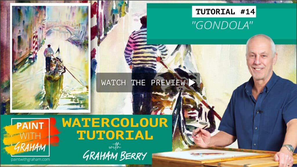
Venice is rich in interesting buildings and sights for any artist but none more-so than a gondola on the Venetian canals. This is a challenging subject to paint, we have water, buildings, people and reflections to consider but we will start with the background washes and move into the detail with our size 16 brush, let’s get our brushes in hand and create something you’ll be proud to hang on your wall.
Read More13. THE RUSTY OLD CAR – PREVIEW

This is something a little different, I usually focus on people about their everyday lives, but couldn’t resist this image of a fantastic rusty old car sat abandoned in the southern USA.
We use three base colours of Winsor Lemon, Permanent Rose and Cerulean Blue to create contrast between the hard rusty edges of the car itself blending into the bright landscape. Using the size 16 brush we’ll move onto add a lot of details by defining the shapes with thick and thin lines using the side and tip of the brush, mixing colours as we go to create the feeling of an ageing classic sat within the beauty of its surroundings.
Get the brushes ready and lets get to it!
Read More12.STREET LIFE – PREVIEW
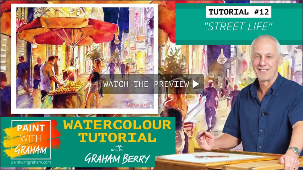
This is an interesting night scene, probably in Prague. It’s darker than my usual paintings, and we’re going to use the colours to mix some interesting shades and create a warm feel at the focal point of the painting. I want to create feel of a balmy evening and bring the street vendors’ stall to life.
We will only be using five colours, but mixing them together to create a nice flow of paint using wet techniques. This helps create lovely soft edges where needed. We will then add wet onto dry to create more details and sharper edges for the focal point of the painting using darker, more intense mixes of those five colours.
I always love painting real life situations, and here we have some great reflections from the street lighting to work with. This is great for beginners and experienced artists and I love the final painting because we’ve all had similar photos from holidays and the techniques can all be applied to a similar photo of your own.
Read More11. AMERICAN FOOTBALLER – PREVIEW

This is a really fun piece to paint, creating the feeling of movement within a painting.
We will start with a background wash using wet in wet to build a nice blurry feel, creating that lovely out of focus feel so that the hero of the painting stands out.
We use lots of wet in wet techniques to create nice soft edges using the 1 inch brush.
We’re using yellow and permanent rose for the background, so we’ll have to work quick here as it’s a staining colour. Once we get paint on the brush we work from top to bottom to get our nice mottled background in place. Once dry we will move on to the subject and start with a light wash to give a basis to add layers, adding darker and lighter paints to produce a sense of movement within the footballer.
We’ll apply some finishing touches, using virtually neat paint to create the badges and emblems, and to give a darker tone to draw the eye into the painting. We’ll also use add some of this darker mix to emphasise the shadows.
Read More09. TROMBONE MAN – PREVIEW
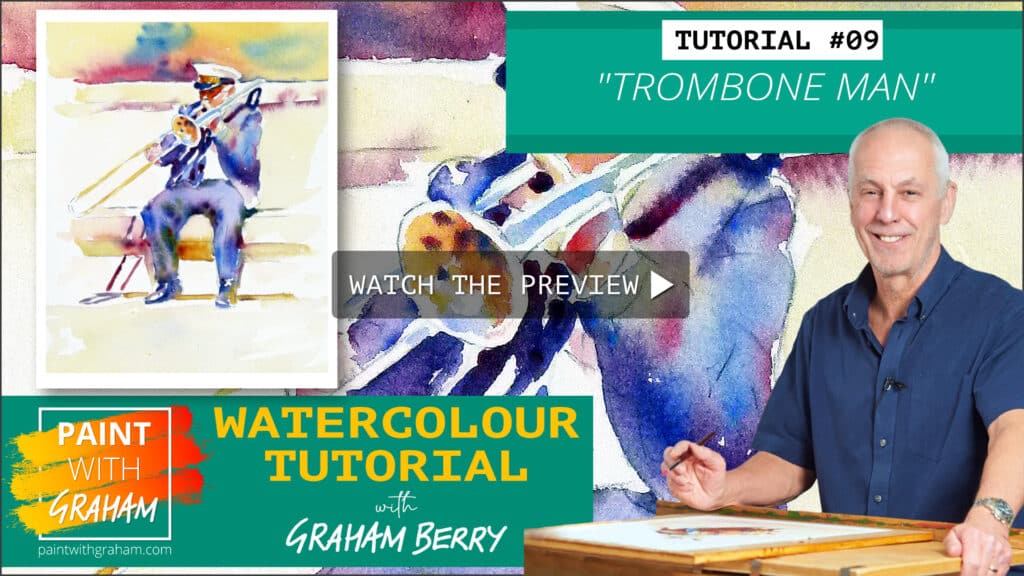
This is a great study painting from the UK; a musician playing the trombone sat a park bench on a bright sunny day. It’s a great painting to try several times to build up your skills and your speed. This one is all about getting those colours prepared and onto the wet paper quickly to get a nice faded effect in the background.
Read More08. RUNNING FOR HOME – PREVIEW
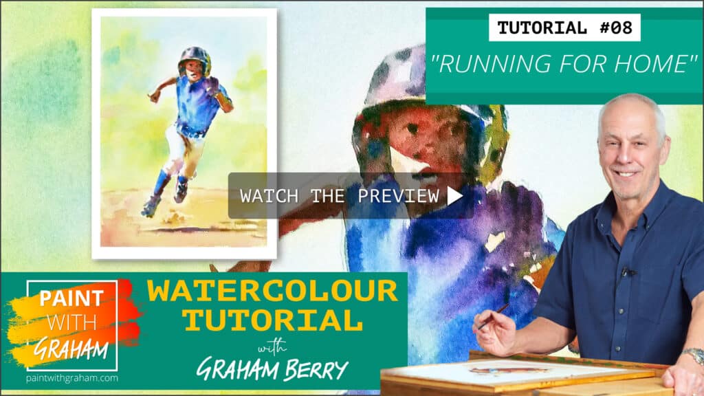
A painting of a young baseball player running for home plate, this is a fun little study in getting the colours onto the paper quickly for the background and then using some slower techniques to add detail to the body and face.
It’s also really fun to add the shadows and highlights, especially in the dusty sand to show where the dirt has been kicked up.
We mix the colours together fairly loosely in this painting and blend them together on the palette as we go along. We use a nice green to “pull” the baseball player forwards off the page to give it a really strong feel that there’s depth in the image.
Read More07. GONE FISHING – PREVIEW
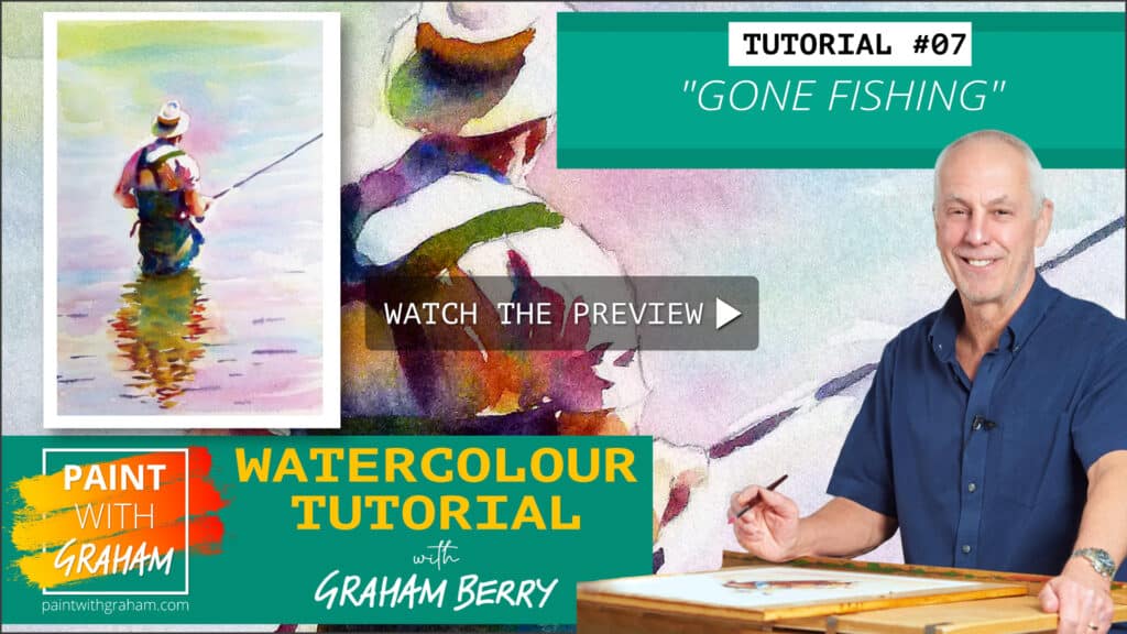
This is about being careful, taking time to do an overall wash and then looking carefully for the ripples in the water. The shadows are really important here as were dealing with a man stood in water.
We’re going to add a hat to the fisherman (its not in the photo) to give it a more traditional feel.
We’ll use the 1 inch and size 16 brush for most of this painting and start with a nice blue wash underneath, moving onto yellows for the underpainting section. We will make sure the pigment goes into the reflection as well as the fisherman, so it gives a realistic feel.
We’ll mix some Quinacridone gold, cobalt blue and crimson to create the darker areas lift out some of the highlights to create shadows and light within the fisherman and the reflections.
We will also mix paint directly on the paper as well as on the pallet.
Read More06. THE CATCHER – PREVIEW
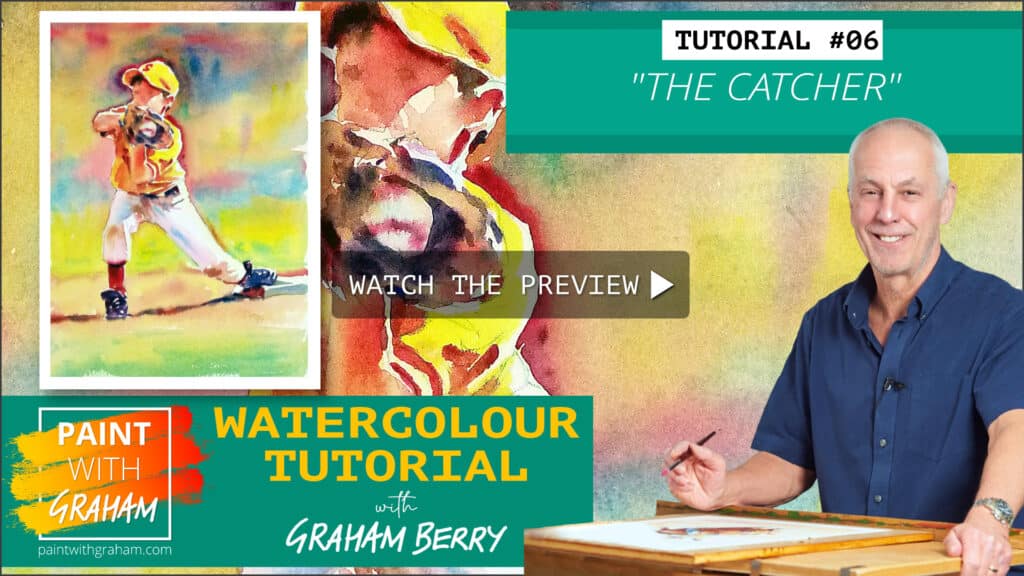
This is a lovely study page of a young boy in the middle of catching a baseball. It’s great as an example of how to paint an action photo you may have. We only use three colours so it’s easy to practice again and again. We’ll use wet in wet techniques with a controlled wash to ensure we don’t lose those highlights in the white trousers. We’ve got some great vibrant colours to use and it will create a stunning finished painting.
You’ll learn how to create both soft washes for the soft focus backdrop and also nice crisp edges for areas like the catchers mitt and shoes, then we will really focus on the creases within the clothes using the tip of the brush.
It’s a great place to start with learning the techniques we use throughout our other lessons.
Read More05. SEA FISHING – PREVIEW
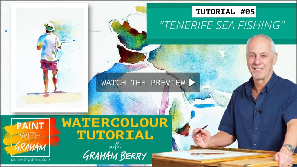
This is all about understanding the methods I’ll use throughout my tutorials and is a great place to start! It’s a great way to learn my techniques, and will give you a good understanding of mixing the colours, both on the paper and on the palettes.
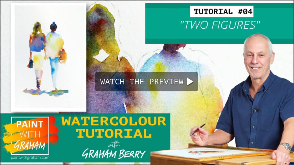
We will focus just on the two women themselves.
Choosing to blend colours directly on the paper allows you to add and adjust different strengths of pigment to meet your preferred colours. This is all about understanding the methods I’ll be using throughout my tutorials and is a great starting point!
Give this a go at least a few times and you’ll be off to a great start.
Get your brushes ready and get practising.
Read More04. TWO FIGURES – PREVIEW
This is a challenge; there are lots of shades of white in the t-shirt and white crashing waves behind him. We will use all of our colours here: We will mix the colours both on the palette and directly on the paper. This gives us the ability to create a really dynamic feel to the focus of the painting.
Painting legs that are in shadow is fun too – it uses far more colours than legs in direct sunlight.
Finally we will add a hint of the ocean, BUT we’re not finishing this one – I want to see how you interpret the remaining parts of the image to see what you come up with! I’ll give you feedback and I’m sure it’ll be great to see the variety we get.
So. get your brushes out, and get painting!
Read More